A complete multi-page website
Dedicated pages explain carpet, upholstery, rug, mattress and fabric car-seat cleaning, supported by process, equipment, FAQs, pricing and contact information.
Ultra Clean · Brand, web & local search
Building a recognisable cleaning brand from the ground up: a confident visual identity, practical everyday applications and a complete online presence for Ultra Clean.
Visit the live website ↗
Approved identity, vehicle design mockup and the launched website.
The brief
For a business that works inside people’s homes, confidence starts before the first appointment. The name on a van, the logo on a shirt, the card left with a customer and the website found in search all need to tell a consistent story.
Our work connected those touchpoints around one clear direction: modern, clean, professional and approachable. We developed the identity and its physical applications, then carried it into a website built around services, local coverage, real work and straightforward enquiries.
01 / Brand identity
The wave-and-spark symbol brings movement and a sense of freshness to the identity. Bold lettering gives the name a clear presence, whether it appears on a vehicle panel or at the top of a phone screen.
The final logo uses solid navy and teal, with Montserrat Black lettering converted to outlines. Its proportions and spacing stay consistent across applications; the standalone mark is kept free of slogans and service lines.
The wider system pairs that distinctive mark with clean typography, generous white space and a restrained supporting palette. It gives Ultra Clean a recognisable look without crowding out practical information.
Navy provides a dependable foundation. Teal introduces freshness. Aqua, light grey and charcoal support the primary pair across backgrounds, highlights and secondary content.
The anchor: logo lettering, headings and strong contrast.
The signature accent: freshness, emphasis and brand recognition.
A lighter supporting colour for highlights and softer details.
Calm backgrounds that give content and photography room.
A supporting neutral for secondary information.
Typography
Black weight in the approved logotype.
A shared type family across the brand and website.
Strong headlines create hierarchy. Readable supporting copy keeps service details, prices and contact information easy to scan. The identity is designed to work at both street distance and mobile size.
02 / Van branding
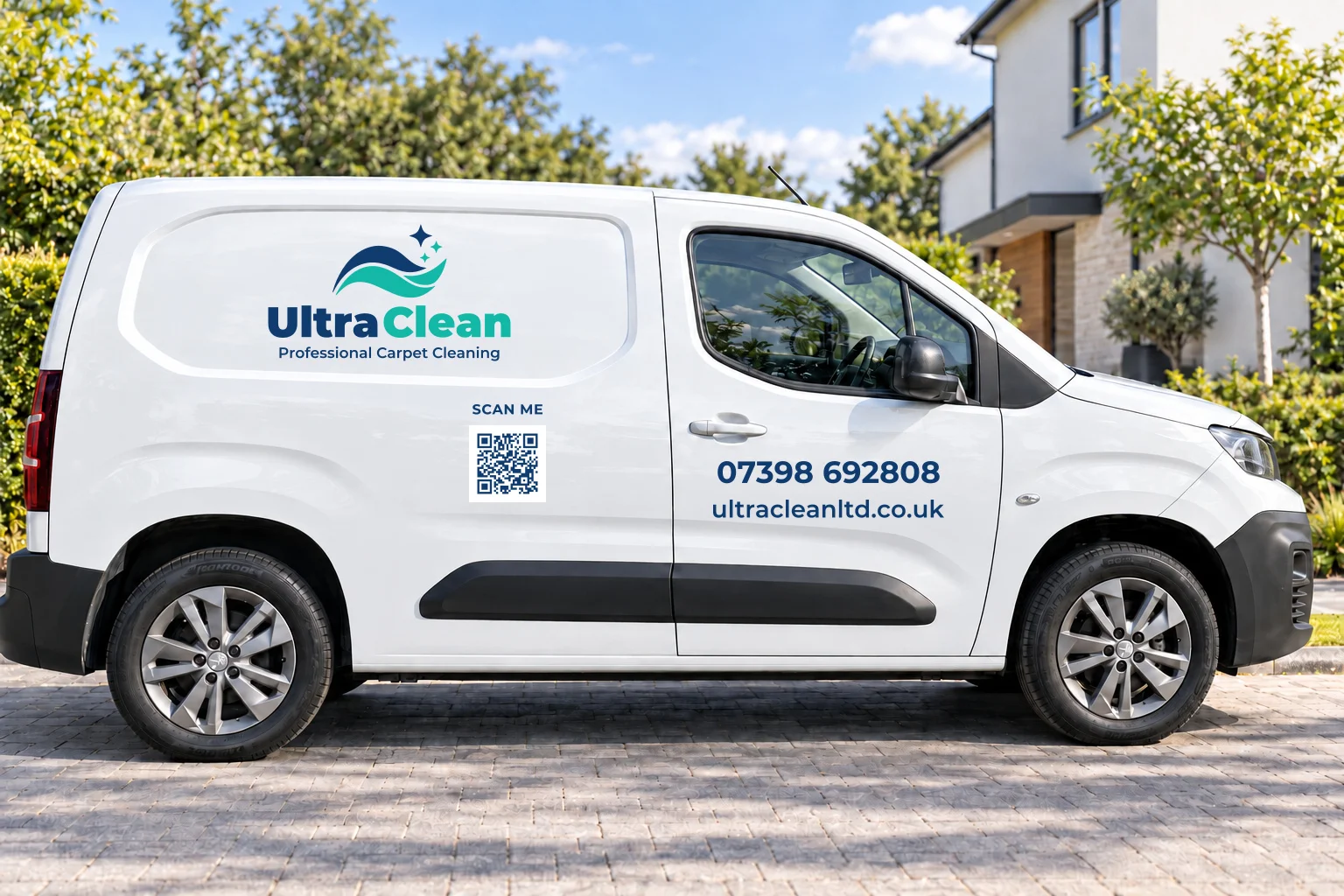
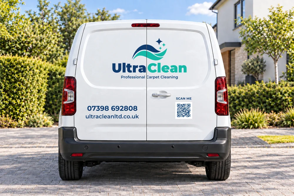
The white Peugeot van becomes a moving introduction to the business. Large side-panel branding pairs the logo with “Professional Carpet Cleaning”, making the offer clear at a glance.
Phone and website details sit in a separate contact group, while a QR code connects the physical vehicle to the website. The front stays simple; the rear repeats the identity and contact route. White space keeps the design legible around doors, seams and handles.
03 / Clothing design
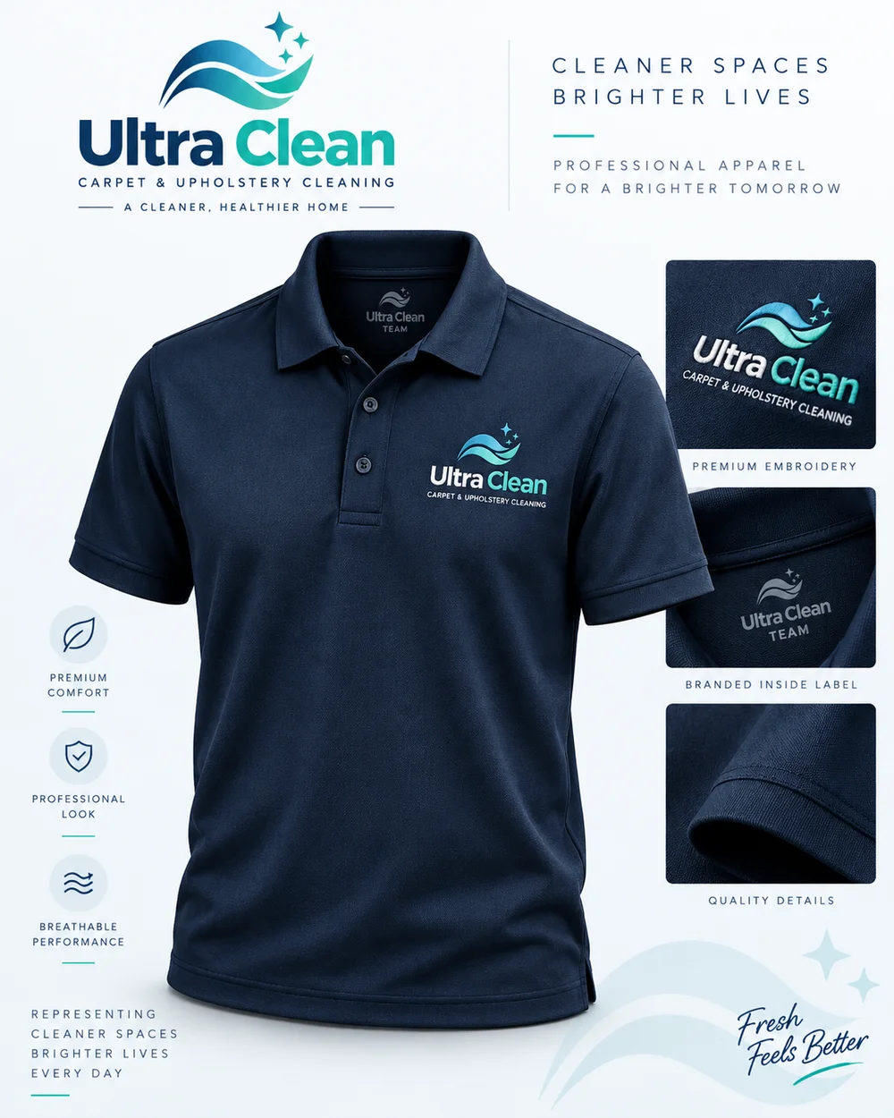
Clothing extends the brand into the customer’s home. The uniform direction uses a navy base with a compact chest logo, creating a professional, recognisable appearance without turning the garment into an advert.
The archived clothing presentation is a polo-shirt concept, exploring logo placement and an embroidered finish. It establishes the workwear direction for the wider shirt and uniform brief.
The approved final logo provides the master for subsequent garment artwork. Print sizing, embroidery digitisation and physical samples are separate production steps.
04 / Cards & print
PROFESSIONAL CARPET CLEANING
07398 692808
ultracleanltd.co.uk
Carpets · Upholstery · Rugs
Mattresses · Fabric car seats
Business card direction, re-presented for this case study with the approved logo and confirmed contact details. Supplier artwork and physical print are separate.
The card direction balances a light, logo-led front with a navy contact side. The hierarchy gives the business name, phone number and website distinct roles, so the next step is easy to find after a conversation or visit.
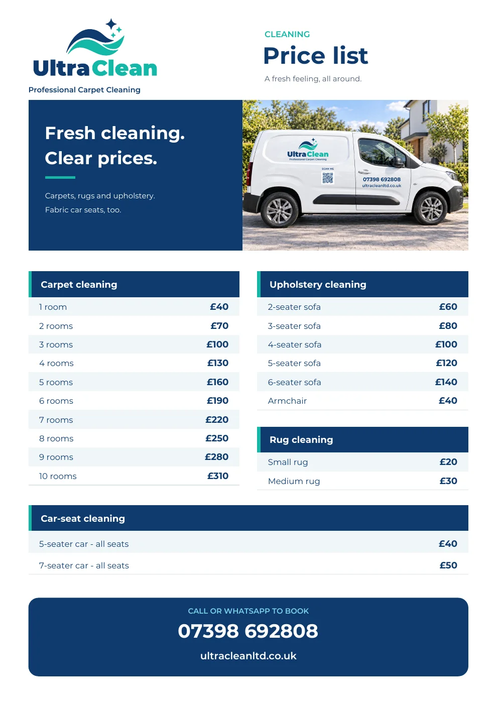
We carried the same colours and typography into the rate card, grouping services and prices into a simple, reusable format. That same pricing information later became part of the website.
05 / Website design & development
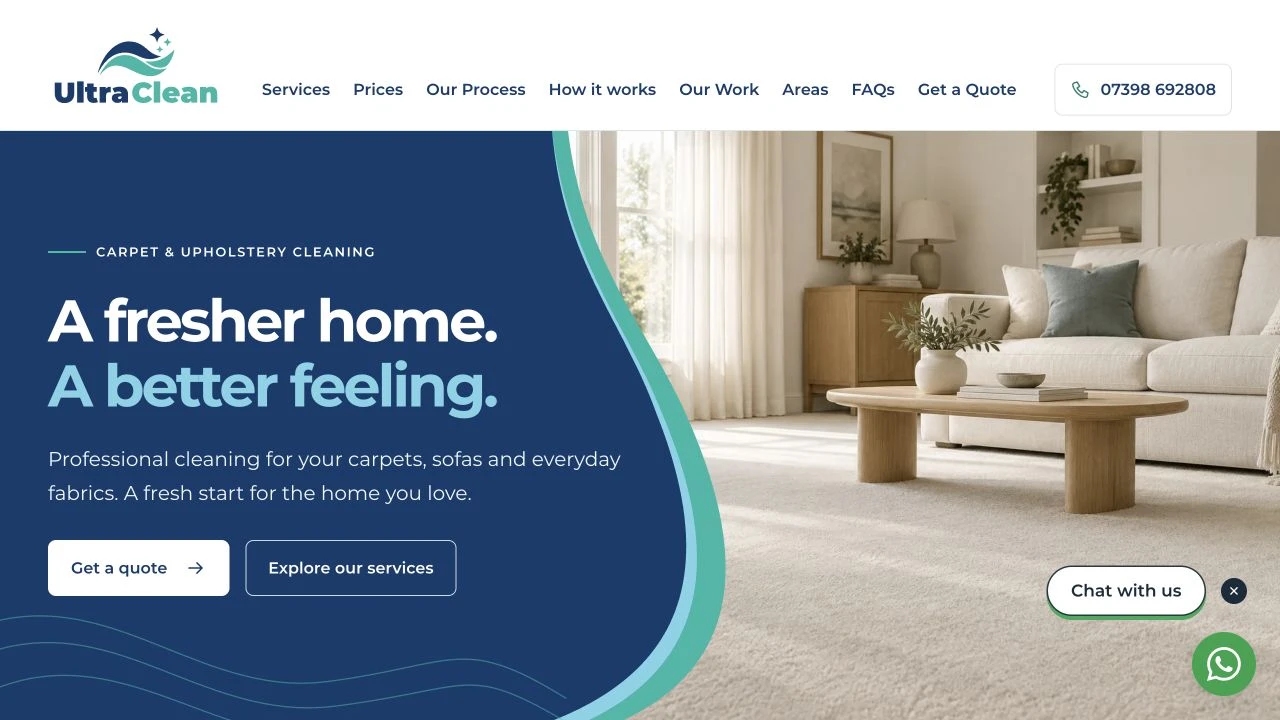
The website brings the identity to life with a wave-shaped hero, confident navy panels, teal accents and welcoming interiors. Beneath the visual design is a practical structure that helps customers understand the service, check coverage and request a quote.
Launched website, captured October 2026. Hero photography is illustrative; the Our Work gallery uses genuine client work.
Dedicated pages explain carpet, upholstery, rug, mattress and fabric car-seat cleaning, supported by process, equipment, FAQs, pricing and contact information.
26 town and village pages connect the service offer with the areas Ultra Clean covers. Nearby links and local enquiry routes help customers find relevant information.
Click-to-call and WhatsApp/SMS quote journeys collect useful job details and let the customer review their message before sending. Appointments are arranged with the team.
An Our Work gallery brings real customer-job photographs together, keeping evidence of cleaning results separate from illustrative service imagery.
One shared pricing source supplies the price page and relevant service and location sections, reducing the chance of conflicting figures across the site.
Crawlable pages, individual titles and descriptions, canonical URLs, structured data, internal links and a sitemap support the site’s search presence.
06 / Google Business Profile
The Google Business Profile work connected the search and Maps presence with the website and the real business. We corrected the contact information, confirmed working hours, expanded the service description and added the relevant upholstery cleaning category.
Service descriptions and approved starting prices clarified the offer. Service-area updates, WhatsApp and Facebook links made the listing more useful, while the approved logo and genuine work photographs strengthened visual consistency.
A factual introduction post linked to the work gallery. The focus was accurate information, authentic proof and a clear route to enquire; search rankings and enquiry growth require ongoing measurement.
Profile work completed · October 2026
Profile updates were recorded on 23 October. Some photos and attributes were still subject to Google processing; public display can vary.
The outcome
Ultra Clean now has an approved identity, a coordinated direction for its physical branding, a launched website and a more complete Google Business Profile. The work gives every customer touchpoint a shared visual language and a practical next step.
5
Core services presented
26
Website location pages
44
Website pages by October 2026
Delivery scope from the project records, rather than traffic or sales performance figures.
Tell us about your business — we'll come back with a plan, a timeline and a fixed quote within 48 hours.